Have you read more than 6 of these books?
Posted by Jay Gunn in Brain dump on November 24, 2010
The BBC believes most people will have read only 6 of the 100 books listed here.
If you want to play along, copy & paste wherever you write; Bold those books you’ve read in their entirety, italicize the ones you started, but for whatever reason didn’t finish (or read an excerpt/Cliff’s Notes). Asterisk the ones you are currently reading (if any), or are planning to read in the near future.
1 Pride and Prejudice – Jane Austen
2 The Lord of the Rings – JRR Tolkien – Originally intended as one volume, but released as 3. Could count for 3, technically. Just sayin’.
3 Jane Eyre – Charlotte Bronte
4 Harry Potter series – JK Rowling – Definitely counts as 7 so already well ahead of the BBC pack.
5 To Kill a Mockingbird – Harper Lee
6 The Bible
7 Wuthering Heights – Emily Bronte
8 Nineteen Eighty Four – George Orwell
*9 His Dark Materials – Philip Pullman
10 Great Expectations – Charles Dickens
11 Little Women – Louisa M Alcott
12 Tess of the D’Urbervilles – Thomas Hardy
13 Catch 22 – Joseph Heller
14 Complete Works of Shakespeare – I’ve read some, not all.
15 Rebecca – Daphne Du Maurier
16 The Hobbit – JRR Tolkien
17 Birdsong – Sebastian Faulk
18 Catcher in the Rye – JD Salinger
*19 The Time Traveller’s Wife – Audrey Niffenegger
20 Middlemarch – George Eliot
21 Gone With The Wind – Margaret Mitchell
22 The Great Gatsby – F Scott Fitzgerald
23 Bleak House – Charles Dickens
*24 War and Peace – Leo Tolstoy
25 The Hitch Hiker’s Guide to the Galaxy – Douglas Adams
26 Brideshead Revisited – Evelyn Waugh
27 Crime and Punishment – Fyodor Dostoyevsky
28 Grapes of Wrath – John Steinbeck
29 Alice in Wonderland – Lewis Carroll
30 The Wind in the Willows – Kenneth Grahame
31 Anna Karenina – Leo Tolstoy
32 David Copperfield – Charles Dickens
33 Chronicles of Narnia – CS Lewis – Only The Lion, The Witch, and The Wardrobe so far.
34 Emma – Jane Austen
35 Persuasion – Jane Austen
36 The Lion, The Witch and The Wardrobe
37 The Kite Runner – Khaled Hosseini
38 Captain Corelli’s Mandolin – Louis De Bernieres
*39 Memoirs of a Geisha – Arthur Golden
40 Winnie the Pooh – AA Milne
41 Animal Farm – George Orwell
42 The Da Vinci Code – Dan Brown
43 One Hundred Years of Solitude – Gabriel Garcia Marquez
44 A Prayer for Owen Meaney – John Irving
45 The Woman in White – Wilkie Collins
46 Anne of Green Gables – LM Montgomery
47 Far From The Madding Crowd – Thomas Hardy.
48 The Handmaid’s Tale – Margaret Atwood
49 Lord of the Flies – William Golding
50 Atonement – Ian McEwan
51 Life of Pi – Yann Martel
52 Dune – Frank Herbert
53 Cold Comfort Farm – Stella Gibbons
54 Sense and Sensibility – Jane Austen
55 A Suitable Boy – Vikram Seth.
56 The Shadow of the Wind – Carlos Ruiz Zafon
57 A Tale Of Two Cities – Charles Dickens
58 Brave New World – Aldous Huxley
59 The Curious Incident of the Dog in the Night-time – Mark Haddon
60 Love In The Time Of Cholera – Gabriel Garcia Marquez
61 Of Mice and Men – John Steinbeck
62 Lolita – Vladimir Nabokov
63 The Secret History – Donna Tartt
*64 The Lovely Bones – Alice Sebold
65 Count of Monte Cristo – Alexandre Dumas
66 On The Road – Jack Kerouac
67 Jude the Obscure – Thomas Hardy
68 Bridget Jones’s Diary – Helen Fielding
69 Midnight’s Children – Salman Rushdie
70 Moby Dick – Herman Melville
71 Oliver Twist – Charles Dickens
72 Dracula – Bram Stoker
73 The Secret Garden – Frances Hodgson Burnett
74 Notes From A Small Island – Bill Bryson
75 Ulysses – James Joyce
76 The Bell Jar – Sylvia Plath
77 Swallows and Amazons – Arthur Ransome
78 Germinal – Emile Zola
79 Vanity Fair – William Makepeace Thackeray
80 Possession – AS Byatt.
81 A Christmas Carol – Charles Dickens
82 Cloud Atlas – David Mitchell
83 The Color Purple – Alice Walker
84 The Remains of the Day – Kazuo Ishiguro
85 Madame Bovary – Gustave Flaubert
86 A Fine Balance – Rohinton Mistry
87 Charlotte’s Web – EB White
88 The Five People You Meet In Heaven – Mitch Albom
89 Adventures of Sherlock Holmes – Sir Arthur Conan Doyle
90 The Faraway Tree Collection – Enid Blyton
91 Heart of Darkness – Joseph Conrad
92 The Little Prince – Antoine De Saint-Exupery
93 The Wasp Factory – Iain Banks
94 Watership Down – Richard Adams
95 A Confederacy of Dunces – John Kennedy Toole
96 A Town Like Alice – Nevil Shute
97 The Three Musketeers – Alexandre Dumas
98 Hamlet – William Shakespeare
99 Charlie and the Chocolate Factory – Roald Dahl
100 Les Miserables – Victor Hugo
Well I don’t feel so bad, now. 34 is a lot better than 6. Most of the ones I’ve started but not finished, I do eventually intend to finish. And, a bit sadistically, I intend to tackle War and Peace. Someday.
Finally “completed” my website
Posted by Jay Gunn in Brain dump, Photography on August 1, 2010
Completed in the sense that I’m happy with the current design. I kept putting off getting it done, though, daunted by the shear amount of photographs I’ve taken over the years, and especially over the past three years. Over the past couple of weeks though, I’ve come to the realization that I don’t have to do ALL the photographs and artwork at once. I could get a few up, just to get things started, and then once or twice a week work on another batch to post.
Having that burden off my shoulders really motivated me for the push to finally get it finished.
My primary goal was to put all emphasis on the art, and get the rest of the page out of the way. I also wanted to keep the site as “pure” as possible. I used one javascript library, Slideshow 2, for the home page slideshow, Twitter’s javascript code to pull my 5 latest tweets, and only very basic PHP includes so that I could avoid having to duplicate tons of code-rewrites over dozens of pages whenever I decide to re-design. Which actually already proved useful, as I even had a last minute re-design that I got implemented. Really more of a tweak of the existing design, but still it was relatively painless thanks to CSS and PHP. Everything else is purely HTML and CSS. I tried to avoid any elements of HTML5, or CSS3, just to keep browser compatibility at a maximum, with a minimum of effort. When they finally reach a standard, I already have a few ideas I’d like to try out 🙂 That said, if you’re on anything prior to Firefox 3, or Internet Explorer 8, I cannot, and will not guarantee the site will render properly. I leave it up to you to take an active interest in your own computer’s security, and get your browser updated.
This was also a bit of a learning experiment for me, too. I’ve always had a pretty decent grasp on HTML, and if tasked to, could write a website from scratch. But I’m a visual person, so my default way of creating websites has been with visual WYSIWYG (or “What You See Is What You Get”) editors. My editor of choice since I got a crack at the pre-release beta many years ago, has always been Dreamweaver. But while I had a pretty solid grasp on HTML, I understood next to nothing about CSS. Especially CSS for design elements, to me it was nothing more than defining font colors, and link behaviors. I was all about tables, and nested tables, and CSS “blocks” just made no sense to me. So I decided to eschew the visual editors, and write all the code by hand. I’ll be honest, that sent me to Google more than a few times looking up CSS syntax, and if it was possible to do things in CSS that previously Dreamweaver would write out the javascript for (such as rollover images, or drop-down menus). Once it finally clicked how the block elements work, and how you can literally place them just about anywhere on the page that you want, CSS really started to make sense overall. I have no illusions that my code is pretty. I’m still very much a novice with CSS, and learning as I go. But I do learn from my mistakes, and when I find a better way to do something, I do it that way. I expect I’ll be periodically re-writing sections of the site as I figure out more efficient ways of writing the code.
This has both re-sparked my interest in web design, and reminded me, sometimes painfully, why I never really pursued web design in the first place. I’ll happily do the graphic work, the design and layout, I’ll even continue doing small, simple websites. But I think I’ll leave the coding to those with more patience than I.
When I started going back through my library of artwork, and photographs, I quickly realized that the artwork would be easy. Just a matter of getting the pieces I like the most up. The photographs, however, not so much. Back in January I once again switched back to Aperture, after having used Lightroom for quite some time. That meant that all of the processing I had done to photos in Lightroom prior to the switch were lost. Yes, they would still be in the Lightroom library, and I could certainly still open that up. But when I set my mind on doing something rash like this, I don’t half-ass it. I was switching to Aperture, so that meant Lightroom had to go. All of it.
Of course it dawned on me recently that it might have been handy to still have it around as I started making picks for what to put on my website.
So to start with, I began parsing through my Flickr account, and I noticed a disturbing trend: my older photos seemed almost dull compared to my newer photos. So I grabbed a few samples, and set about re-processing the RAW files. What I found to my surprise, my current processing method applied to my older photos made a dramatic improvement to them. Comparing them side by side with what I had previously uploaded to Flickr, I was honestly shocked.
So for the pictures going on my website, a lot, if not all of them are also getting re-processed and replaced on Flickr. I’ve learned a lot about processing over the past few years, and have developed my artistic style. Some of the older photos, I feel, suffered from my lack of post-processing knowledge. Some contrast, some exposure correction, maybe some spot removal, and call it a day. There’s nothing wrong with that, of course, but over the years I’ve grown to appreciate a little more dramatic sunsets, more saturated and vibrant colors, etc.
The thing is what the camera captures, and what the eye sees aren’t always in sync. As an example: on the beach I may have had a “wow” moment, and quickly set up and took a shot, only to later get it in Lightroom (or now Aperture) and be a little underwhelmed by it. Technically it’s still a good photo, framed like I wanted, everything in focus that I wanted to be in focus, etc. But any number of factors at play could cause it to just not be awesome. Maybe the sunlight was too harsh and washed out the colors, or mist from the crashing waves gave this overall hazy look, or I neglected to attach my CP filter, or warming filter, or any number of things that just weren’t what I saw when I was standing on that beach. Three years ago, I did not fully understand what all the adjustments in Lightroom would actually do beyond the basics of white balance, exposure, brightness, contrast, and saturation. I’ve learned a lot since then.
Now I’m left with a dilemma:
A) Reprocess and re-upload/replace all my older photos.
B) Just reprocess and replace the ones I want to put on my website?
B would be easiest, but then it will leave sets with originally processed and re-processed photos, and especially for similar shots that can look awkward.
A would require the most work, and as Flickr only lets you replace one image at a time, no batch operations for that, the prospect of a couple thousand photos to replace just makes me cringe. The only viable way to do it would be to sacrifice view counts, and just re-upload the re-processed images, and delete the older images. And then there’s the matter of images that have been favorited. I would likely just manually replace those in order to not break anyone’s favorites link.
Right now I’m leaning toward going with B initially, and then over time going through and replacing all the old images. For sets with only a few images, I’ll probably just replace them, thus preserving view counts as well. But for sets with 100+ images, I think I would rather smash my face into a brick wall several times over, than manually replace them one at a time. For photos over, at, or near 100 views, they will be manually replaced. The rest can kiss their view count good bye.
Ugh! Looks like I’ve got my work cut out for me.
RAW vs. JPEG
Posted by Jay Gunn in Aperture, DAM, Lightroom, Photography on March 28, 2010
It’s a question asked over and over in forums, on websites, or even person to person. Someone new to photography, or most often new to DSLR photography, will inevitably ask the “pros” whether they should shoot in RAW or in JPEG.
Unsurprisingly there are a number of opinions on the subject. Anything from “Always RAW,” to “Always JPEG,” to “Depends on the shot,” and so, so many others.
While I’m not going to say definitively one way is right over the other, my personal view is that you should always shoot in RAW. To explain my standpoint, I’m going to start by giving you a comparison of the technical differences between a RAW photo, and a JPEG photo. Then some pros and cons. And finally I’ll give you some real-world examples.
But first, a bit of an anecdote; When I first got into DSLR photography in 2007, I was excited at the prospect of finally being able to shoot in RAW. I did my research, which lead me (like many others) to Ken Rockwell, and his “RAW vs. JPEG” post. In that, he does everything in his power to demonize RAW, declaring it to be a pointless waste of space and offering no advantage over JPEG. And he clinches his argument by declaring he only shoots in JPEG, and furthermore, on the Basic quality setting. Basic. That means highly compressed. It was at that point that I realized he’s bonkers. All of the examples he gives make it sound like he’s working on a computer that’s 10 years old, which makes sense because I believe that post was written in 2004. 30 seconds to open a single RAW image? Not any time in this decade. An example of someone shooting a Nikon D1X (an older professional camera) with only a 256MB memory card? Can you even still buy anything less than 1GB? Perhaps what he says was good advice in 2004, but it’s 2010 now, and his post is no longer accurate. It wasn’t good advice in 2007, and it’s certainly not good advice in 2010.
Technical Stuff
Now I’ve been interested in photography since 1995 when I took a Photojournalism class in High School because I needed an extra credit. I thought it’d be nothing more than a blow-off class, and I ended up falling in love with taking pictures. Some time before that I started working with digital imaging, and learned the difference between compressed and uncompressed images. I know that compressed images can look just as good as an uncompressed one, when done right. In college I even successfully argued for the use of JPEG still frames for my demo reel animations, instead of uncompressed Targa images that took up 8-10x the space, but visually looked no different.
Back then though, there wasn’t a 16bit colorspace, at least it wasn’t widely used. So when a JPEG and a Targa both share the same 8bit colorspace, it’s hard to imagine why one would keep the uncompressed Targa over the compressed JPEG if they look identical. Work uncompressed, finish compressed. That was my mantra. It means work in an uncompressed format (like Targa, TIFF, BMP, etc), and once you’ve finished your work and ready to archive it, save it out as a compressed JPEG (with the highest quality setting, of course). This works, because you’ve finished the work, and are no longer going to be altering the final image. So that even though they shared the same 8bit colorspace, when working with the uncompressed image, you never have to worry about compression artifacts building up and ruining your image with each subsequent save.
Now 16bit colorspace is far more prevalent. The RAW files that DSLRs produce utilize a fraction of that 16bit colorspace, with most consumer level cameras producing 12bit RAW, and higher-end consumer and pro cameras producing 14bit RAW. To give you an idea how colors increase exponentially, I’ve done the math here. To determine the amount of levels in a single color channel (R, G, or B) in a given colorspace, you take 2^x where x is the bit depth of the colorspace.
So for an 8bit image:
2^8 = 256 levels in each color channel.
For a 12bit image:
2^12 = 4,096 levels in each color channel.
For a 14bit image:
2^14 = 16,384 levels in each color channel.
Do you see that exponential growth? Each additional available level in the color channels equates to more information that you can work with. More ability to correct white balance, or pull back highlights and blown out whites, or bring up shadows and get some detail where there once was only black. Those levels refer to a scale from 0% of the color in that channel (or Black) to 100% of color in that channel (or Red, Green, or Blue). So with 8bit you have 256 levels from Black to Red/Green/Blue. With 12bit you have 4,096, and with 14bit you have 16,384. White is 100% of all three colors, and Black is 0% of all three colors.
So while 100% red will look the same whether you’re on an 8bit image, or a 14bit image (they’re both 100% on the Red channel), you will have far more variations available to you from full black, to full red, and this results in smoother color transitions. When you start mixing the three color channels, it results in far more colors available.
I should note here that you may often hear about “24bit color,” or “True Color.” This is a bit of a misnomer because all it really is, is taking the bit depth of each channel, and adding them together. So 24bit RGB is equal to 8bit R, 8bit G, and 8bit B, 8+8+8 = 24. If you apply that to the formula above, you would have 24bit, 36bit, and 42bit. I personally prefer to just stick with referring to the bit depth of each color channel. It’s accurate, and eliminates the potential confusion that someone who’s not knowledgeable about it might have; ie: “How can a 12bit RAW possibly have more colors than a 24bit JPEG?”
To see the total amount of potential colors available at each bit depth, you take the same formula, but then you also raise it to the power of 3 in order to accommodate each color channel.
8bit: 2^8^3 = 16,777,216 total colors. 16.7 million. This is JPEG.
12bit: 2^12^3 = 68,719,476,736 total colors. 68.7 billion. This is consumer level RAW.
14bit: 2^14^3 = 4,398,046,511,104 total colors. 4.4 trillion. This is pro-sumer and professional level RAW.
Let’s take a look at some pros and cons of each format.
| RAW | JPEG | ||
| Pro |
Con |
Pro |
Con |
| 12-14bit color depth | Slightly larger file size | Slightly smaller file size | 8bit color depth |
| Easy to work with | Requires a little more work out of camera* | Easy to work with | Cannot do much beyond what you get out of the camera** |
| Easy to share | . | Easy to share | . |
| Uncompressed, or lossless compression | . | . | Lossy compression |
* This is more or less neither a con nor a pro. With the software you’ll be using it’s extremely easy to automatically apply a quick tweak to make sure your RAW image matches what you saw when taking the picture. I only put it as a con, because out of the camera a RAW file is often flat and dull compared to a JPEG, and inexperience will usually lead one to assume that’s a bad thing. The reason this is, is because a RAW photo has no processing done to it. You do the processing. JPEG on the other hand already has processing done in camera. The camera automatically applies contrast, saturation, and sharpening to the image. The most common analogy made when discussing RAW and JPEG in photography, is to say that you should think of the RAW as your negative, and the JPEG as the developed final image. With a negative you have a great ability to push or pull the exposure, or tweak the saturation, the contrast, etc. But with the final printed image, you’re pretty much stuck with what’s there. Which leads to the next footnote:
** Because the camera bakes contrast, saturation, and sharpening into the photo, you’re left with little leverage after the fact. If the shadows are too dark, you don’t have the ability to lighten them very much. If the sky is blown out, you don’t have the ability to recover much of the detail. While I mentioned that a little out of camera work on a RAW is technically not a con, this most certainly is.
At first glance they look fairly evenly matched. But when you’re talking about photography you should be thinking about getting the best images possible. And with the higher bit depth of color available when you shoot in RAW, that to me weighs a lot more in favor of RAW than a slightly smaller file size does in favor of JPEG. And I do mean slightly smaller. I shoot with a Nikon D80 which is 10.2 megapixels. The RAW images it produces are anywhere from 10-14 megabytes each. The only acceptable JPEG compression in my opinion is Fine, and that produces images that are 6-8 megabytes. Sure, this small difference starts adding up when you’re talking about 1,000, 5,000, 10,000+ images, but even at the most drastic size difference (6 megabytes vs. 14 megabytes) we’re talking about ~8 gigabytes of storage difference for every 10,000 images. With 1 terabyte hard drives (~1,024 gigabytes) costing $100 or less now, and continuing to come down in price, I’m more than happy to sacrifice 0.08% of my hard drive in order to ensure I will have the most control over my images.
Now, I wasn’t always of this mindset. When I purchased my first DSLR I thought that maybe I would use JPEG for any snapshots and photos that I wouldn’t consider “artistic.” Stuff like pets, and the family holiday gatherings, etc. That I would use RAW for my “artistic” shots, stuff that I would consider adding to my portfolio. This worked out ok for a little while, until one day I forgot to switch back to RAW when I went to shoots some of those possible portfolio shots. Not only did I forget to switch to RAW, I forgot that my white balance was still set for an indoor fluorescent light. And here I was snapping away in sunshine and shade. After a while of this it dawned on me, and I switched back to RAW and Auto on the white balance. But the damage was already done. When I got back to my computer to sort through the days photos I tried to fix them with white balance adjustments, but it was no use. I ended up trashing all of the JPEGs from that day, simply because they were unsalvageable.
My alternative from then on was to either shoot RAW+JPEG, or just RAW. Now this may sound a little hypocritical of me, but hear me out: I chose to stick with RAW, because RAW+JPEG just seems like a pointless waste of space. The reason it’s not hypocritical in light of my “hard drives are cheap” reasoning above, is because RAW+JPEG offers absolutely no advantage over just shooting RAW. I’m willing to use extra space for RAW, because it offers significant advantages over JPEG. But using extra space to store both a RAW and a JPEG is just pointless and silly.
The proponents for RAW+JPEG try to argue that it’s better because you have the RAW to play around with when you want, and the JPEG that you can immediately share with family and friends. Now I don’t know about you, but my idea of sharing photos with family and friends is either emailing them, posting them on Flickr, SmugMug, Picasa, or printing them out for them. In all of those cases I can do that very shortly after getting the photos into my computer. If I have my computer with me, it’s even more instantaneous sharing. The only scenario that I can imagine you could possibly make a case for RAW+JPEG is if you want to copy off your pictures to your family or friend’s computer from your camera. But there’s one flaw even in that scenario: Picasa is free, and works on Mac, Windows, and Linux. So no matter what operating system their computer is using, you can download (if they don’t already have it) Picasa and import your RAW photos from your camera. And if they have a Mac, chances are they already have iPhoto. Sure, they may not have the processing ability of something like Aperture or Lightroom, but they do have enough that you can punch up the colors and adjust contrast and sharpening. They have enough that your RAW images wont look flat and dull.
The myth that working with RAW images is so much more difficult than working with JPEG images is just that: Myth. It may have had some merit 10 years ago, maybe even 5 years ago, but times have changed. It’s time we stop perpetuating this myth.
Still not convinced? How about some actual real-world examples?
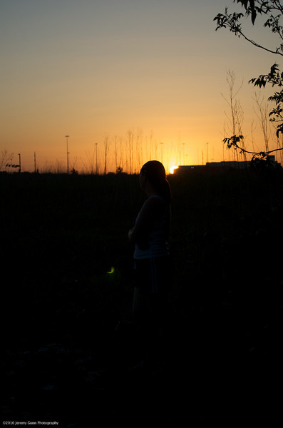
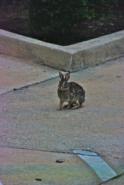
On the left side is the RAW, unprocessed, straight out of the camera. For this shot I was going for the silhouette look, but for the purpose of demonstrating the advantage of RAW over JPEG, let’s see what details are hidden in there. This was taken with a Nikon D40.
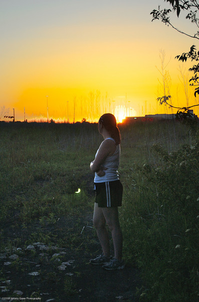
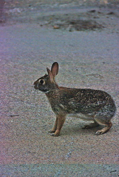
On the right side is the RAW, processed. This is quite amazing as the bottom half of the shot was practically solid black. But because RAW has far more variations in each color channel than JPEG, I was able to recover just about everything in the shadows.
Here are the Aperture processing settings (and their Lightroom equivalent if there’s a difference):
+2 Exposure
-5 Black Point
100 Shadows (Lightroom equivalent is Fill Light)
Burn brush at 75 to pull the sky back from being blown out
Curve adjustment to bring in some contrast. (Lightroom 3 Beta 2 finally added full curve adjustments, but only for the luminance channel (the lightness/level of all 3 colors combined.) Fortunately luminance is adequate for this adjustment.)
I could have pushed exposure even higher, or added some brightness to further improve on this. But I think this more than adequately demonstrates the level of control you have when you shoot RAW.
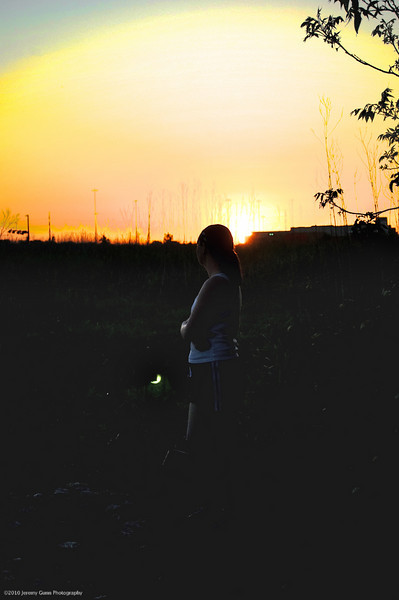
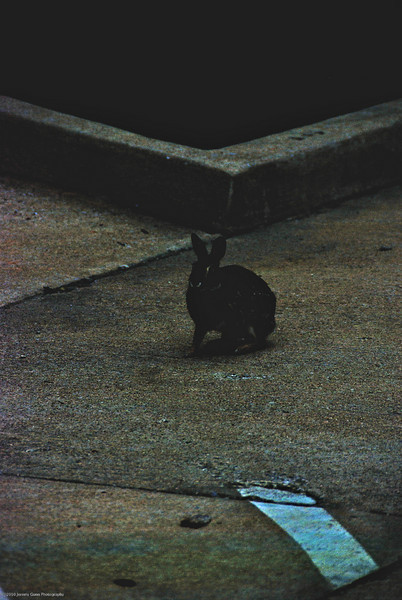
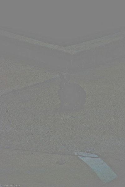
On the left side is the JPEG, unprocessed, straight out of the camera. For all the JPEG conversions I took the out of camera RAW and exported it as JPEG with 100% quality. This would be equivalent, and actually even a little better than shooting JPEG Fine with the camera (Fine is typically around 85-95% quality).
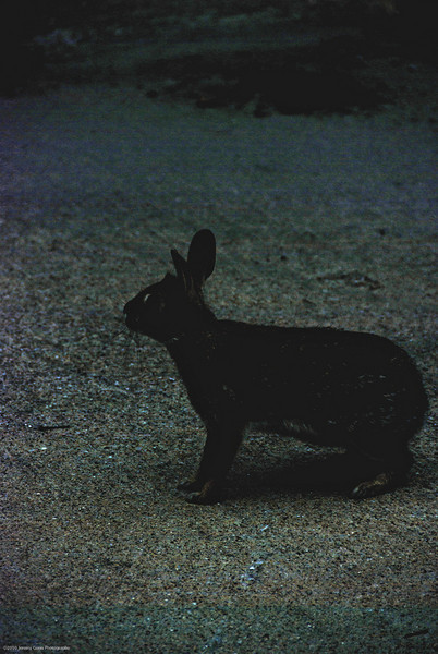
On the right side is the JPEG, processed. It’s almost laughable how little recoverable detail is available in the shadows with the JPEG. I even kept the contrast from going fully black, just to prove those areas are actually missing details, and are rather solid blocks of color (or lack of color).
Here are the processing settings:
+2 Exposure
-5 Black Point
100 Shadows
Burn brush at 75 to pull the sky back from being blown out
Curve adjustment to bring in some contrast.
Shocking, isn’t it? Now you not only have the hard numbers, and the pros and cons, but also visual proof how drastic a difference you can get with RAW. And remember how I said the file size difference between the RAW and JPEG are only slight? Granted these are D40 and much smaller than my typical D80 shot, but the RAW file is 3.7 megabytes while the JPEG is 1.8 megabytes.
Let’s see another example, this time with severe over-exposure:
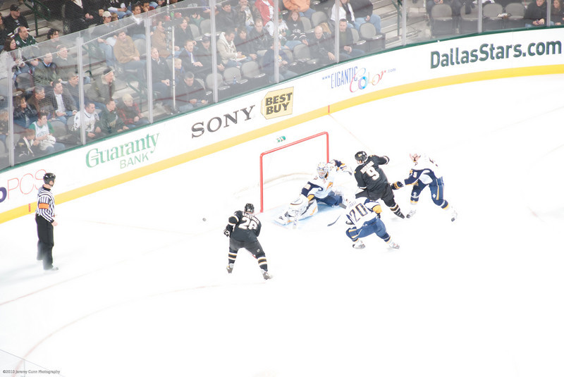
This is the straight ouf of camera RAW, unprocessed shot. For this shot, I focused on the player around center ice where it was considerably darker with more players clustered, as well as graphics on the ice. Unfortunately, even though I had continual focus set, it seems my D80 did not re-meter the shot as it traveled from the darker center ice, requiring a longer exposure, to the brighter goal area that needed a much shorter shutter speed. The brighter ice, combined with the longer exposure conspired to produce this blown out shot.
Isn’t RAW wonderful? This could actually be a usable shot now.
-2 Exposure
+3 Black Point (this is default)
50 Shadows
Curve adjustment to bring in some contrast.
It could probably use a little Burn brush to bring down the highlights in the ice a bit more, maybe even continue bringing the exposure down overall. But you can already see a drastic improvement. Details that were lost to white are now visible and distinguishable.
By the way, the file size for the RAW file is 6.8 megabytes while the JPEG is 4.34 megabytes. Still a minor difference in file sizes.
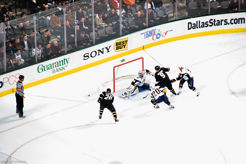
Here’s the JPEG conversion, looks identical to the out of camera RAW.
And here’s the processed JPEG. Same processing settings, save for the curves which I manually tweaked in order to get even this level of detail recovery.
Where’s the goal net? Hell, where are the players? They simply disappear, disembodied uniforms strewn across the ice. And most of the graphics on the ice are gone.
For fun I did a couple more that I re-discovered in my library recently:
On the left is what came out of the camera. I kid you not. And on the right is what I was able to recover in just a few seconds. If you look really close, you can see the faintest hint of the paint line in the bottom right corner if you don’t believe these are the same pictures, and not just a black rectangle sitting next to the real photo.
This is what happens when you’re most definitely NOT a morning person, and you’re up far too early to try and comprehend your camera settings at that particular moment. I took this shot and looked at my LCD, then scratched my head wondering why it was blank. So I took a 2nd shot (I’ll get to that one in a bit), and it too was blank. Then it slowly started to dawn on me, and I checked my camera settings:
ISO 100 oops! (Remember, this is pre-sunrise early dawn), zoomed in to 200mm f/5.6. Oh yeah, and -5ev. DOH! These shots were about a year ago, so I don’t remember exactly what I was shooting prior that I had it set to -5ev, but them’s the breaks. This is precisely why I shoot RAW 100% of the time, at least I can typically fix my dumb mistakes.
+2 Exposure, that’s right. Just +2, which roughly equates to making the -5ev a -3ev.
-5 Black Point
.2 Brightness
100 Shadows
Curve adjustment to bring in some contrast.
I could probably push it farther with more exposure, but since this isn’t that great of a shot anyway, I wasn’t going to spend much time on it. But the point that needs to be made is that if this was one of those great shots that you only have one chance to get, and you forget to properly adjust your camera settings… with RAW you have a chance to get at least something out of it. Yes, this highly exaggerates the noise (this ISO 100 looks more similar to something between ISO 1600 and 3200), but a high ISO usable image is far better than having to trash your image because JPEG just can’t compete.

Here is the JPEG conversion, and the processed JPEG on the right.
I’ll be honest, far more than I expected was recovered from the near black. But this image is still most definitely not usable. Again I pulled back on the contrast a bit to show the large blocks of gray, and show that they really are solid blocks and there are no details present.
+4 Exposure
-5 Black Point
.2 Brightness
Curve adjustments to bring in some contrast.
You’ll notice I even increased the exposure to +4 instead of +2. +2 was still far too dark.
And just to demonstrate how magical curves really are, here’s the JPEG conversion with all the same processing settings, with no curves adjustment:
It’s truly amazing what a slight adjustment to the curves can actually do.
Shot attempt #2:
This is the 2nd attempt that I mentioned earlier. On the left is what came out of the camera, and on the right is what I was able to recover in just a few seconds. You’ll just have to trust me on this one, I can’t see anything in the out of camera shot that I can point out to show they’re the same image.
+2 Exposure
-5 Black Point
.2 Brightness
100 Shadows
Curve adjustment to bring in some contrast.
I could probably push it farther with more exposure; that and a tighter crop might actually make this shot usable.
And the last one, I promise:
Here is the JPEG conversion, and the processed JPEG on the right.
Yep, still unusable and beyond repair.
+4 Exposure
-5 Black Point
.2 Brightness
100 Shadows
Curve adjustments to bring in some contrast.
Mathematical proof that RAW is the superior format, proof that the pros and cons do not weigh in favor of JPEG, and irrefutable visual proof using real world examples.
Which format you use, however, is ultimately up to you. It’s my hope that you’ll see the advantages of RAW far outweigh the negatives (no pun intended). And if your camera doesn’t have the option to shoot RAW images, and you’re forced to use JPEG, then hopefully if you’re serious enough about photography this post will be that extra incentive for you to finally upgrade to a DSLR. For the many other advantages of a DSLR, not just RAW.
When thinking about what software to use for processing you can go the free, or extremely cheap route with Picasa, or iPhoto. The major drawback to these is the lack of extensive processing tools. You could probably get similar results like these by fiddling with the Exposure, Highlights, Shadows, Brightness, and Contrast sliders in those programs. It probably won’t as drastic an improvement, but at the same time hopefully you don’t need that drastic an improvement. Hopefully your shots are good enough that you only want minor or no tweaks. And if you primarily are interested in nothing more than snapshots and family photos, by all means stick with the free options. It’s not very likely you’ll be shooting 3000-5000 or more photos each year.
On the other side of free you’ve got applications like Apple’s Aperture, and Adobe’s Lightroom. Aperture will run you $199, and $99 for future upgrades. Lightroom is $299, and $99 for upgrades. These applications typically have had 18-24 month cycles between major upgrades, so if you’re serious about your photography, even if you’re no more than a hobbyist or amateur for now, it’s worth your while to budget $100 every couple years for one of these upgrades (granted the initial cost to get started will require more budget). There are, of course, other options for software. There’s Bibble Pro, Capture One, Lightzone, and even your camera manufacturer’s own software (at least Nikon and Canon produce their own, not sure about other brands). But these two are the big ones, these are the ones the vast majority of photographers who use software like this will be using. If you use Windows, then your choice is fairly clear; Aperture is only available for Mac, while Lightroom is available on both (and if you use both, naturally a single license only covers the operating system you bought it for. If you want to use it on both systems, then you have to buy two licenses.)
I personally have used both Aperture and Lightroom, from their 1.x versions up until now (Aperture just hit version 3 about a month ago as of this writing, while Lightroom is currently in open beta testing for version 3, and should be available within the next few months.) For my thoughts on both, you can check out my post.
All of these programs make working with RAW just as easy and painless as working with JPEG. From organization, to adding contrast, saturation, or sharpening. They also all make sharing them ridiculously easy. You can email them, or send them to any of the major photo sharing sites, either built in directly to the program or through various plug-ins developed for them. And of course printing is readily available. You’ll even get your choice of printing a single 8×10 per page, 2 4x7s, 4 3x5s, and several other layout options. The only real question you have to ask yourself is whether you’re serious enough about photography to justify spending money on software, on top of your gear. At the very least go download the 30 day trials of Aperture and Lightroom, play around with each one separately (don’t try using both at the same time, it won’t give you adequate “face time” with each individual application to familiarize yourself with it enough to make an informed decision). Grab Picasa and play around with that. And if you have a Mac you’ve already got iPhoto, so play around with it too. Find the one that works best for your needs and roll with it.
So what’s it going to be? RAW or JPEG? Above all, always remember to have fun.
Whoa, whoa, WHOA! Wait, really?!
I received this picture a couple weeks ago in my email. I naturally missed it because it was sent by someone I have automatically filtered out of my inbox and into a holding folder where I may, or may not, check it at some point to see what other crap this particular individual has been forwarding.
Here’s the picture:
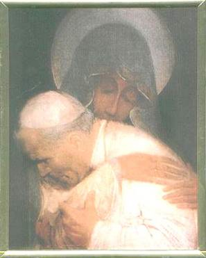
And here is the accompanying text in the email:
We don’t know why John Paul II wanted to hide this picture for years. The Vatican published this picture recently, for first time. This picture was taken by one of his security guards just when the Pope was attacked and was falling down in his Papamobil. You can see the pain in his face.
Take a look at the above picture. You can see Mother Mary holding John Paul II in Her arms when he was shot in 1981.
This happened on May 13, 1981. Pope John Paul II was shot as he arrived in St. Peter’s Square to speak to the people who had gathered there. When he was shot, he was holding the rosary, which he always carried. When he fell to the ground, out of nowhere, a woman rushed to his side and embraced him. That pic is shown above. The picture is said to have been taken by one of the gathered people who was busy taking Pope’s pics with his camera. The woman vanished as quickly as she appeared.. The gunman was apprehended in the square and sentenced to life in prison. The pope was critically wounded but survived after surgery and a long recovery. The surprising fact is that all the bullets passed just past his vital internal organs. When he recovered finally, the first thing Pope asked for was his rosary. When he got it in his hands, he said that he felt Mother Mary directing the bullet’s path through him. Sure, John Paul II was always in the habit of praying the rosary regularly. He had once said, “The best prayer I like is the Rosary.”
Joaquin Navarro Valls, who is the one spokesman from The Vatican, said that they made a lot of studies for years of this incredible picture and, of course, about the quality of the developing of the picture because when it was developed nobody could see very well because the image was not clear. Finally, and after so many controls and by looking and checking by all the experts in photography (around the world), they decided that there were no tricks in it and today they give us this beautiful gift from our Mother of God. You can see the Mother of God holding John Paul II in her arms. Beautiful, right?
This is a joke, right? It has to be.
This is very clearly, and very obviously a painting, yet this email is passing it off claiming it to be not only a real photograph, but even backed up by “all the experts in photography (around the world).”
Right. And whom are these experts we’re speaking of? Any names given for the supposed photography experts? Nope. Just the claims of some random person, from some random email, forwarding it on one gullible person at a time.
Is it any wonder spam is so overwhelmingly prevalent? These mass forwards are like every birthday, Hanukah, and Christmas present all wrapped up in one with a shiny red bow for the spam-bots and zombie computers silently collecting email addresses without the user ever being the wiser.
Oh, I should also mention that according to Truth or Fiction, Joaquin Navarro-Valls, mentioned in the email, has said this “photograph” was not released by the Vatican, nor was it taken by any security guard assigned to Pope John-Paul II.
My DAM quest, it is over!
Posted by Jay Gunn in Aperture, DAM, Lightroom, Photography on February 17, 2010
I made the switch to Mac OS X mid 2007. And shortly after that, I finally bought myself my first DSLR, something I’d wanted to do for almost a decade since I first laid eyes on the Nikon D1. I knew it was going to re-spark my love of photography, and so I knew I was going to need a good way of keeping up with my photos. Before I’d made the switch, I’d been keeping up with the competition heating up between Apple’s Aperture, and Adobe’s Photoshop Lightroom. So when I got my DSLR, I grabbed the trials for both Aperture and Lightroom, and gave them a go.
Since that day, I’ve been flip-flopping between them. I literally would shift my entire workflow from one to the other, roughly every 4 to 6 months. I always preferred Aperture’s UI and workflow, but Lightroom had the features I wanted. And whenever I was using Lightroom I always missed the Photoshop-like spot healing/clone brushes that both Aperture and iPhoto shared. And of course the lack of integration with the iLife Media Browser didn’t help Lightroom’s case, either.
About a month ago, my not unusually large catalog of ~20k images (which only consisted of mid2007-2009 photos, older ones had not been imported yet) was just getting to be too much for Lightroom 2. Slow, slow, sloooooooow. I tried to remedy it by breaking up the catalog into year long archives. It helped the speed tremendously, but I discovered one fatal flaw: my collections/smart collections got borked because they were holding images that now were no longer in the current catalog.
With no word (as per usual) from Apple on whether Aperture 3 was even being considered, I started looking for alternative DAM software. Convinced, as I was, that I’d rather just have something that cataloged my media, and leave the editing/tweaking to Photoshop. “Just use Bridge!,” you might say. I have, and I don’t like it. It’s always been incredibly sluggish, and I’ve used every version from CS2 to CS4. I’ve never been happy with it’s performance.
I tried everything from Nikon’s own Capture NX, to Bibble Pro, to LightZone (JAVA?! RUN AWAY! It was stupid slow), and even tried out a port of digiKam from the Linux world. I even contemplated just using iPhoto again. Nothing was making me happy, and in a moment of desperation, I even installed Picasa. I’d used it on Windows before I switched, and I remember liking it. Imagine how shocked I was that it handled 20k+ files like a champ. But it’s integration with Photoshop was non-existent, not to mention with the rest of the system, iLife, iWork, etc.
After a few weeks of trying new software, I finally broke down, and just re-installed my old copy of Aperture 2, wrote my Lightroom metadata to the files, and command-option dragged my folders into Aperture (this imports them as referenced files so you can still use your existing organizational structure, and each folder becomes a project). It handled the ~20k photos superbly.
To bring in all my keywords, star ratings, flags, and labels, I had to get a little creative. Before writing all the metadata to the files in Lightroom, I went through and sorted by each star rating from 1 to 5, and gave all 1 star pictures a keyword of “1 Star.” Rinse and repeat for 2-5. I then sorted by all flagged photos, and wrote a “Flickr” keyword, as I only flagged photos I had uploaded. And finally for all the photos I added a color label to, I added a “Label: [color].”
Once those were written to the files, and I was in Aperture, it was merely a matter of doing a quick search for each of the “Star” keywords, and applying the appropriate amount of stars to the images. For the flagged photos, I created a Flickr smart album that collected all photos tagged with “Flickr,” and the same for each color label. It was clunky, but at least it worked.
The only other things I missed from Lightroom were the adjustment brushes, and adjustment presets. But I often found the brushes clunky, difficult to use, no real fine-grained control, so if I needed more than a simple touch-up I would always hit Photoshop for that instead. Not a big loss. The gradient was only useful in very limited situations, and that too I would mostly defer to Photoshop for since I could at least mask out the areas I didn’t want the gradient applied to. Again, not a big loss. Presets then, were my most missed feature of Lightroom.
So there I was, getting by with Aperture 2, and thinking it’d be really nice if it had Faces & Places. I always try to add keywords of people in images, but it can be very tedious. Some automated assistance is nice, and even though iPhoto quite humorously mistook various things for faces sometimes, the faces it did get right made it very quick and easy to tag family and friends. Of course there was Maperture which did a decent job of geotagging, but again in iPhoto, Places was so nice to be able to drill down from a country-wide search, down to city level, and even landmarks, all in an intuitive and easy to navigate interface. Click on a pushpin and see exactly what photos were taken there.
I’d very nearly given up hope that it would ever come out. After the iPad event, and still not even a hint of Aperture love, I was beginning to feel like so many others, that Apple was no longer bothering with Aperture. That Lightroom had won the market, just like Photoshop before, and we were all doomed to be locked into Adobe’s monopoly on creative software. I was almost convinced of this, though I’ve been so disillusioned of Adobe’s software for the past decade or more, that I wasn’t about to give in without a fight. I was going to stick with Aperture 2 until I could no longer install it if that meant not spending another moment fighting with Lightroom. What can I say, I was bitter.
And lo, a week later, Apple drops the Aperture 3 bomb. It came, quite literally, out of nowhere.
Faces & Places? Check.
Adjustment presets? Check. Finally!
Flags? Check.
Color labels? Check.
Adjustment brushes? Check! And not just adjustment brushes like Lightroom does them, but actually incredibly useful adjustment brushes, with fine-grained control that rivals the masking I’d normally have to defer to Photoshop for. The ability to brush in or away any of the various adjustments available, as well as pre-defined brushes for things like dodge/burn, blur, and skin smoothing. They didn’t just catch up to Lightroom here, they went way, way beyond.
Curves! True curves. Oh, I kind of half assumed any update to Aperture would have some adjustment brushes, though I had no idea how incredible they would be. But this, this I never saw coming. I know there are photographers out there that don’t even bother with any other adjustments, and just tweak the curves a bit to get their pictures just right. Problem is, the only place you could really use curves for Photography, was Photoshop. Sure there are other applications out there with curves, Lightroom even has a very limited half-assed implementation (seems to be the same crippled “curves” they finally blessed Photoshop Elements with). But few of them work with anything over 8 bit color per channel (otherwise known as True Color), and the ones that do, are either pretty terrible or buggy and still quite beta level software. When you’re working with RAW photos that themselves contain 12-14 bits per channel, you have to compromise way too much if you’re not working in an application that supports at least 16 bits per channel. So it’s either use Photoshop, or sacrifice almost 69 billion subtle color variations, lost details in shadows and highlights, etc, and that’s only for photos with 12 bits per channel. I’ve been meaning to write up a post on RAW vs. Jpeg, looks like I’ll be doing that next.
And you know what? I honestly don’t see Adobe ever fully adding these features into Lightroom. Why? Photoshop. These are such killer features in Aperture 3 that I may never need to fire up Photoshop again, and you bet your ass Adobe knows this. Why give that level of control to photographers for a mere $300 for a copy of Lightroom, when they can also suck out another $600 for a copy of Photoshop for the inevitable times you’ll need more fine-grained controls and adjustments that Lightroom just doesn’t give you?
In fact, to put my money where my mouth is, I’ve removed Photoshop CS4 from my system, and haven’t missed it in the slightest, and I used to use it almost daily. Pixelmator& The GIMP handle my web design needs with aplomb, and far speedier than loading that resource pig, Photoshop. I’ve been trying for the past ~10 years to find a suitable replacement for my Photoshop needs, and now, finally, I honestly believe that day has come.
Five reasons to switch to Aperture from Lightroom? All I need is 2: Useful adjustment brushes, and curves. Though Faces & Places aren’t too shabby in and of themselves, either.
All is not unicorns and rainbows though. There is one, albeit minor, complaint: they removed the keyword panel from the Metadata tab. I’m not talking about the Keyword HUD, or the Keyword Control Bar. The keyword panel was a roll-up panel in the Metadata tab, that gave you an alphabetical list of the keywords assigned to the photo(s) you have selected. You could type in a keyword there, and it would apply it to all the selected photos (which the Keyword Control Bar does now), but you could also click the “-” next to a keyword in the list, and it would remove that keyword from all the selected photos (which there is no way that I’ve found to batch remove a single keyword from a group of photos. It’s either all, or none.)
[Update: 03/03/2009] I recently came across an apparently undocumented feature. When using the keyword control bar to apply keywords to all selected photos, if you instead hit shift-return, it will remove the keyword you have typed in from all selected files. Just hitting return applies the keyword to all selected photos, and hitting shift-return removes it. Still not as nice as the panel from Aperture 2, but far, far better than being faced with deleting a keyword one picture at a time, or dumping it all together, and having to remember which photos it should have been on when you go back to re-create it.
That’s one area Lightroom has over Aperture. It’s all the more confounding because the keyword panel in Aperture 2, at the least, made managing keywords on par with Lightroom (even if it was lacking some of the more fine-grained, stock photo centric, keyword options that Lightroom has). This is a step backwards, where most everything else was a giant leap forward.
I’m hoping this was an unfortunate oversight, and will be returning in a near future update. 3.0.1? Please?
